11 Modern Logo Design Trends: The Future of Visual Branding
The world of logo design is constantly changing. Designers have more tools to create stunning brand identities as visual communication methods and technologies progress. In 2024, we can expect logo design trends that leverage new digital capabilities while honouring timeless design principles.
This article will explore some of the most exciting modern logo design trends poised to make an impact this year and beyond. Whether you’re a designer looking for inspiration or a brand manager hoping to revamp your company’s visual identity, read on for an insider’s guide to what’s heating up in logo design.
Simplicity and Minimalism Reign Supreme
Less is more regarding modern logo design. Brands today recognise the power of simplicity – clean, sparse designs that immediately convey a brand’s essence. We’re moving away from complicated graphics in favour of stripped-down, minimalist logos that feel fresh and modern.
Some benefits of simple, minimalist logo design include:
- Easy to recognise and remember
- Flexibility across different media and sizes
- A timeless aesthetic that withstands shifting design trends
- Allows the brand personality to shine through.
Minimalism also enables more creative use of space and colour. By eliminating excessive decorative elements, designers allow key graphic features to stand out for maximum impact. Expect minimalism to continue reigning in 2024 as the dominant logo design trend.
Hand-Drawn and Handcrafted Styles
While technology has opened up new frontiers for logo designers, there has also been a revival of interest in handcrafted imperfection. Today’s brands seek to convey authenticity and approachability, leading to demand for hand-drawn logo styles. The organic, handmade aesthetic connects with consumers who crave individuality and human touches in branding.
Key characteristics of the hand-drawn logo trend:
- Loose, sketchy lines with natural imperfections
- Appearance of watercolours, markers, coloured pencils and other physical media
- Variations in stroke width and intensities
- Artisanal touches like paper textures or stamps
Designers today can deploy digital tools like Illustrator to recreate the hand-drawn look. When paired with a minimalist approach, the resulting logo feels nostalgic, warm, and curiously anti-tech – an appealing contrast with most brands’ heavily digital identity.
Vibrant, Expressive Colour Palettes
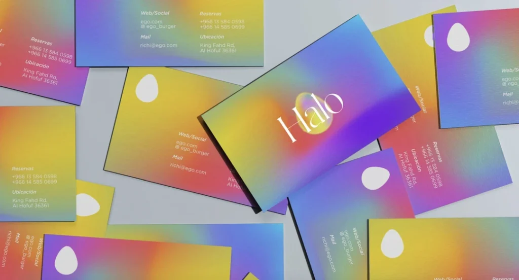
Why use muted shades when vibrant hues feel so fresh and fun? Brand designers today realise that colour conveys powerful cues about a company’s personality. Boosting colour saturation and combining unexpected colour combos creates youthful, lively logos that reflect modern aesthetics. From bright neon hues to audacious duotone pairings, expect designers to embrace colour in bold new ways.
Strategies for using colour creatively in logo design:
- Boost saturation levels of primary brand colours
- Combine complementary or contrasting shades that pop.
- Use colour gradients for dimension and visual interest.
- Add or alter colours seasonally for a variety
- Keep black and white as graphic neutrals.
Vibrant colours feel celebratory and optimistic – perfect for a brand hoping to make a confident statement while standing out. Danish brewery Mikkeller applied this principle beautifully in their colourful, expressionistic logo update.
Abstract Shapes and Optical Illusions
Today’s logos frequently incorporate dimensional shapes or optical illusions within their graphic marks. Dimensionality adds depth and layers to a logo’s layout using principles of mathematical perspective. From 3D spheres to abstract shapes playing tricks on viewers’ eyes, contemporary logos often have an intriguing quality that hooks attention.
Benefits of dimensional shapes and optical illusions in logo design:
- Creates visual interest and intricacy
- Imbues logo with a sense of breadth and depth
- Feels unexpected compared to flat graphics
- Captivates viewers by challenging their spatial perception
- Leverages mathematical principles to strike visual harmony
A great example is the FedEx logo, which cunningly hides an arrow shape within the negative space between the “E” and “X.” This hidden dimension enthrals viewers while speaking to the dynamic, forward-thinking nature of the brand. Expect more designs in 2024 to activate underutilised dimensions in similarly subtle yet show-stopping ways.
Hand-Rendered Typography
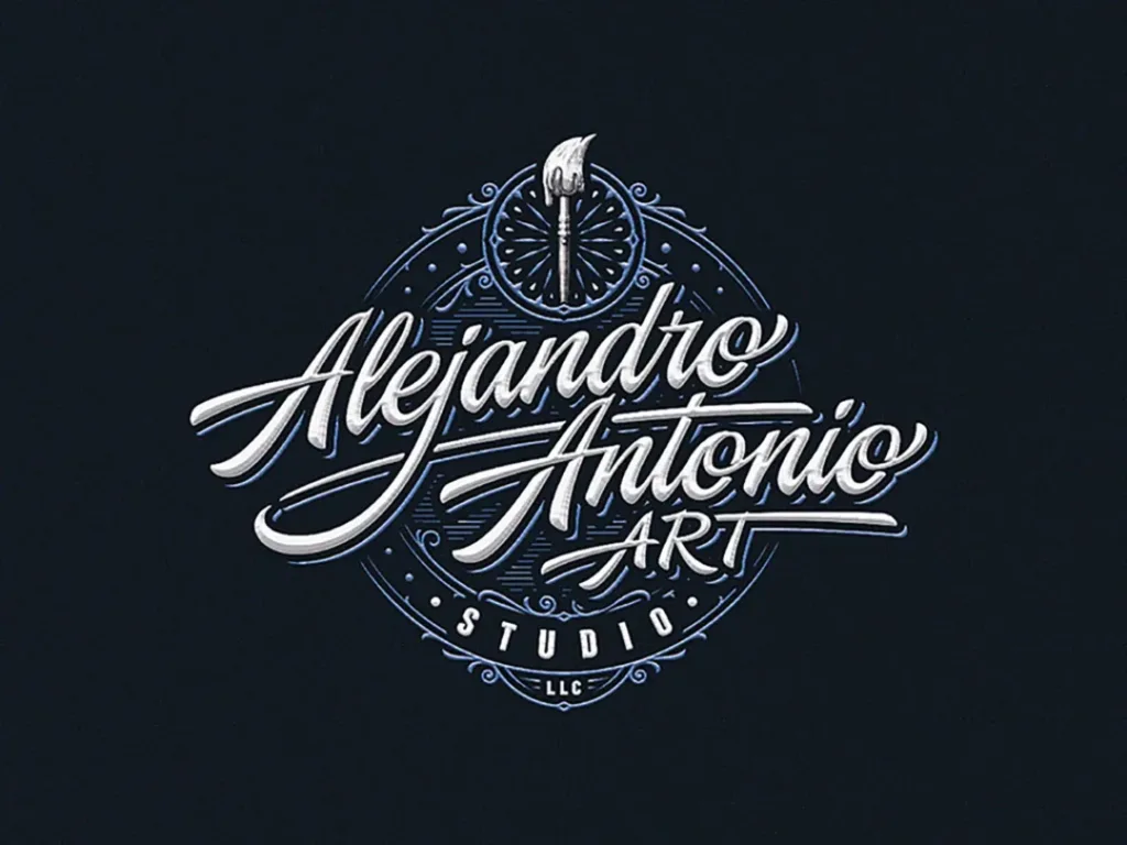
Custom-drawn letterforms are another way designers add an original flair to modern logo design. Typographic logos will remain prevalent in 2024, but brands increasingly request display and script typefaces over default system fonts. Hand-rendering letterforms open exciting opportunities for injecting brand personality – from flows and ligatures to tiny illustrative embellishments.
Advantages of bespoke hand-lettering in logo design:
- Distinctive and proprietary typography
- Reflects the designer’s unique creative vision
- Harmonises perfectly with accompanying graphic elements
- Wide variety of font personalities to match brand voice
- Physical media can be incorporated for an organic look
Custom lettering requires glyphs out of an entire alphabet, but digital tools have shortened this process. The finished letters sing with the brand’s essence while giving viewers typographic details to pore over appreciatively. As system fonts become overexposed, hand-drawn fonts help build brand recognition and loyalty through stylishly bespoke letters.
Geometric Shapes and Patterns
Another overlaying modern trend is using geometric shapes and patterns within logo layouts. Circles, triangles, diamonds, grids – structured graphic shapes feel stable and balanced, conveying order even when daringly arranged. Patterns also bring motion and depth to a design. Combined, geometric patterns energise a logo with hints of mathematical ponderousness – strangely pleasing to our pattern-loving brains.
How geometric shapes bring logo design power:
- Circles and curves = approachability, community, inclusiveness
- Squares and angles = stability, balance, professionalism
- Triangles = energy, action, forward movement
- Grids and line frameworks = structure, connectivity, networks
Leafy greens company Verival artfully deploys geometric minimalism in their logo update. See how shapes and lines communicate freshness and vitality in an abstract botanical pattern. Expect this combination of geometric and natural elements to thrive in 2024 for maximum visual metaphoric meaning.
Authentic Reflections of Culture and History

While prevailing trends provide helpful style inspiration, most brands seek a logo that authentically reflects their cultural heritage and brand backstory. The most impactful logo designs capture a nuanced symbolic visual language brimming with contextual references only the target audience will fully appreciate. History and culture remain invaluable anchor points for logo creation, from symbolic icons to regional typographic styles incorporating vintage design motifs.
Tips for culturally contextual logo design:
- Research brand origins, vision and target consumers for guidance
- Reflect geographic heritage through landscape palettes and regional design styles
- Reimagine or modernise historical brand assets or archives
- Stylise product ingredients or company heritage in illustrations
- Speak to audience values and passions through conceptual associations
By conveying cultural authenticity and insider flair, logos spark immediate consumer rapport and recognition. For example, see how Apple’s original logo evoked Isaac Newton’s encounter with gravity through the famous falling apple, linking the brand with revolutionary innovation and human progress.
Responsible Design and Sustainability
With eco-consciousness at an all-time high, branding today must also convey a commitment to responsible design and sustainability principles—logos for 2024 aim to feel ethically considered, not exploitative or culturally appropriative. Graphic production should honour green best practices – recyclable packaging, eco-friendly inks and dyes, and minimal waste. The sustainability movement also means creating minimalist but adaptable logo assets focused on longevity vs trends.
Strategies for sustainable logo design:
- Prioritise versatility and flexibility for maximum lifespan
- Design responsibly using eco-friendly, non-toxic materials and methods
- Streamline visual assets to reduce production waste
- Use graphic symbols meaningfully vs appropriating cultural IP
- Ensure all graphic elements tie directly to brand strategy and vision
2022’s Mexico City Design Biennale sets an example by requiring all branding design partners to share sustainability commitments publicly. Expect more brands to recognise ethical imperatives and transparency behind logo design processes rather than focusing purely on visual outcomes.
Dynamic Brand Marks
Print media and signage no longer constitute the only surfaces for brand logos today. In our digital era, logo marks must pop on mobile screens and apps while feeling cohesive across print touchpoints. This expansion means logos must function more dynamically and be able to adapt, transition, transform and respond to shifts in sizing or layout. Dimensional logos and generative visual systems enable brands to exist fluidly across contexts.
Benefits of dynamic logo designs:
- Flexibility across digital and physical touchpoints
- Visually compelling motion design applications
- Allows for seasonal iterations or special editions
- Reduces production waste from static design assets
- Creates intriguing interactive potential
Additional logo animation and transformation methods to watch:
- Responsive logos that shift colours or layout at specific interaction trigger points
- Generative logos with algorithmic abilities to endlessly evolve and transform
- Augmented reality (AR) and virtual reality (VR) applications that bring static logos alive
- Logos that utilise machine learning to optimise their presentation format across contexts
As digital environments become more immersive, brands can think past stationary logo design to experience their identity dynamically.
Typographic Agility Across Languages
Another modern design challenge is adapting branding across global linguistic contexts. With globalism firmly entrenched in business culture, brand marks must display nimbleness across alphabets and scripts. Custom typographic logos require advanced glyphing capacities to communicate fluently while maintaining visual cohesion.
Tips for improving logo design adaptation internationally:
- Ensure core graphic emblem transcends specific language
- Test logo in both translation and transliteration scenarios
- Use multilingual design systems that share properties across linguistic iterations
- Enable modification abilities in ambiguous letter characters
- Implement optical adjustments to suit different glyph densities
Rather than simply adding language tabs to websites, brands now recognise the need for fundamental visual identity flexibility from the outset. Top international brands like Samsung and LG have led the development of “superglyphing” to allow dynamic typography responsiveness across alphabets, including Chinese, Arabic, Hindi and Thai script.
Contextual Communication Through Animation
Once logos enter digital environments, animated movement unlocks game-changing modes of communication. From animated explainers to video intros, logo animation directly spotlights branding meaning and personality traits through sound, motion and temporal narrative. This contextual layering can efficiently relay brand origins, vision, services, voice and more to aligned audiences.
Benefits of logo animation:
- Conveys an interactive, engaging brand experience
- Brings static marks to life with dynamism and energy
- Allows introduction of audio for enhanced storytelling
- Offers flexibility for long or short-format content
- Captures viewer attention amid endless digital noise
For example, Canadian web developer studio Line47 animated their logo to transform from graphics into CSS code. This simple motion creatively links their name to their actual service offering in a delightfully memorable way. Expect more brands in 2024 to discover their ‘origin story’ through lively logo animation tailor-made to introduce and humanise their mission.
Critical Considerations For Modern Logo Design and Updates
Creating an on-trend modern logo that stands the test of time requires carefully balancing current design elements with strategic branding principles. While daring creativity fuels cutting-edge style, the logo’s effectiveness depends on laying solid, functional foundations. As we’ve seen, logo design trends come and go, but a few tried-and-true practices reliably nurture memorable, compelling brand marks regardless of ephemeral aesthetics.
Timeless Design Fundamentals Still Rule
Exciting stylistic trends provide helpful creative jumpstarts but never overshadow design fundamentals. Composition, colour theory, grid systems, scale and ratios, visual hierarchy, negative space, and typographic clarity – these foundational principles always underpin effective branding. Start by reviewing design basics rather than fixating solely on transient trends. Analyse why existing brand marks captivate response through form, shape, texture and colour arrangements. Establish how graphical elements interact to create symbolic meaning before introducing eye-catching ornamentation.
While modern logo design leverages cutting-edge digital capabilities for animation, transformation and beyond, its success relies on the designer skillfully implementing universal design fundamentals first. Mastering the basics frees creativity to evolve visually based on contemporary cultural moments and brand needs. But anchoring innovations in long-tested creative building blocks ensure substance beyond passing style.
Simplicity and Memorability Reign Supreme
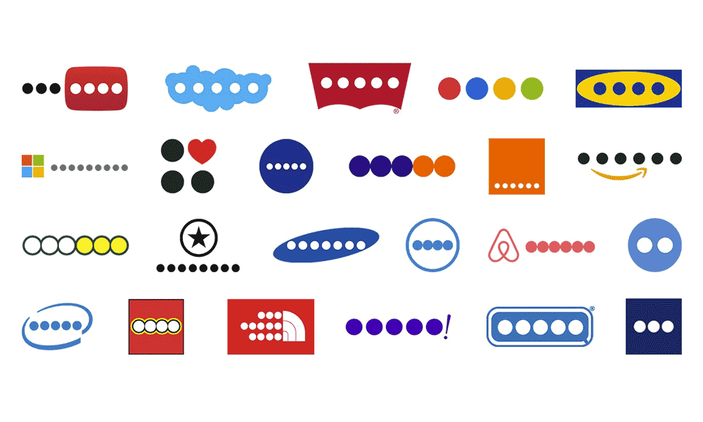
Another classic principle retaining priority is simplicity for memorability. When logos get overcomplicated for fanciful details, effectiveness and recognition suffer. As explored earlier, today’s design strategies favour minimalism because streamlined logos are more easily comprehended, recognised and recalled. With brand visibility depending intensely on audiences connecting quickly with a logo’s symbolic meaning, the sparse yet strategic design allows rapid cognitive connections.
This means evaluating whether each visual component pulls clear branding weight in an application. Final logo designs should strip away decorative elements that lack strategic representational purpose. If components only exist for aesthetic reasons or current trendiness, reassess their necessity. If visual features don’t directly communicate desired brand attributes or enhance consumer connections, restrain the impulse to include them merely for graphic excitement.
Prioritising simplicity is an act of design confidence and respect for the audience’s ability to engage. When executed thoughtfully, minimalism focuses viewers on rich symbolic details worthy of sustained consideration. Master minimalist brands like Nike and FedEx demonstrate how stripped-down logos activate viewers’ imaginations while conveying core values. Savvy modern logo updates will artfully balance the latest visual daring with timeless simplicity for original yet easily comprehended outcomes.
Future-Proof Adaptability is Key
With change accelerating faster than ever, no logo remains static. Evaluating logo lifespan means anticipating farther into the future than brands traditionally have. Logos serving for 50+ years exemplify what longevity requires – built-in adaptability to enable flexible application as contexts evolve.
Critical strategies for resilient, future-proof logo design:
- Prioritise typographic marks for language flexibility
- Design modular graphic elements that allow rearrangement
- Utilise versatile geometric shapes rather than trendy icons
- Enable logo to responsively scale without losing clarity
- Avoid culturally specific references that could become insensitive
Rather than constantly undergoing costly redesigns, logos should withstand the next decades’ uncertainties through steadfast, meaningful design. Imagine political, cultural, and technological shifts when making 2024 design choices—test visualisation capacities under various scenarios. Building innate responsiveness and resilience helps logos remain identifiable yet dynamic civic entities for more significant impact over time.
Evaluating Modernisation of Existing Logos
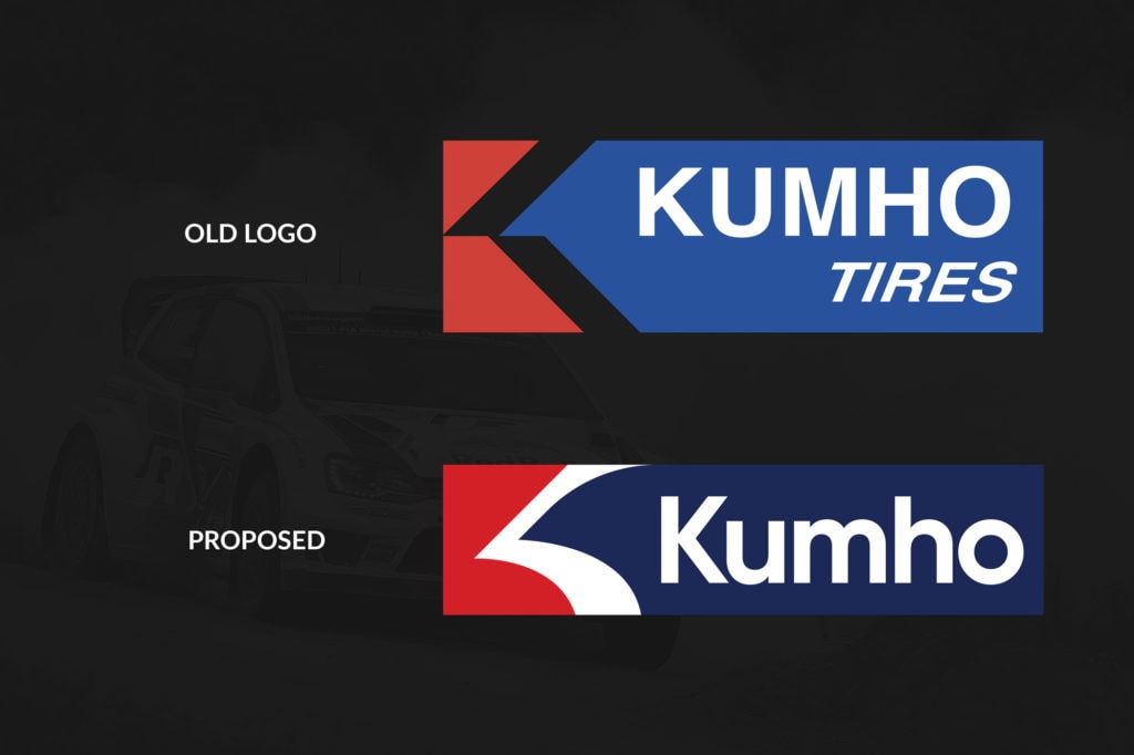
Improving recognition and alignment with modern aesthetics is alluring yet risky for established brands considering logo redesigns. Revitalising brand marks that have existed for years presents unique design challenges requiring thoughtful evaluation. How can legacy brands freshen stagnant visuals while retaining equity and consumer connections?
To Update or Not Update? Key Questions to Ask
With redesigns costing hundreds of thousands in associated brand collateral updates, the decision to modernise cannot be taken lightly. Begin by clarifying the primary reasons for change using the helpful framework of questions below.
Why modernise?
- Does the existing logo misalign with evolved brand values or offerings?
- Does it feel outdated or lag visually behind competitors?
- Has the industry or cultural context changed drastically since its last design?
- Have technical requirements for reproduction specs or file formats changed?
Why not modernise?
- Does the existing logo still strongly resonate with target consumers?
- Would long-time customers negatively perceive change as abandoning heritage?
- Is aesthetic datedness not currently hurting performance or recognition?
- Are visuals still consistently reproducible and effective digitally?
Carefully balancing the pros and cons of change is imperative before initiating updates solely based on trendiness. Determine specific misalignments, weaknesses or technical hurdles the redesign aims to solve first. Weigh these urgent needs against risks of disrupting existing resonance. Use market research, testing and visual audits to demand evidence one way or another.
Especially for brands with long legacies, making limited refinements to improve reproduction while retaining heritage makes more sense than total stylistic overhauls. Change is unavoidable, but make strategic choices based on brand goals rather than react mindlessly to each passing design trend.
Modernisation Best Practices
Upon confirming through analysis that a redesign is essential for progress, focus extra attention on respecting existing equity and consumer connections. Maintain visual consistency wherever possible to ease transition shock. Brand marks are like dear old friends — even refreshed appearances take time to feel familiar again after years of loyalty and positive experiences.
Helpful methods for smoothly modernising legacy brand marks:
- Retain and highlight the most recognisable existing graphical assets that still resonate strongly today.
- Keep original typography or colour palettes largely intact for consistency.
- Overlay new stylistic elements carefully to enhance rather than overwhelm existing foundations.
- Add dimensional elements like gradients or shadows for increased depth vs flat graphics.
- Adjust layout or spatial balance. Improved modern reproductions can make overly intricate vintage engravings or early digital vector shapes feel cleaner and more focused.
Small incremental shifts are often more successful than sudden dramatic visual departures. Allow target audiences to participate via surveys to guide change direction. Test consumer response early and often. Brand Marks, beloved for generations, deserve special care when receiving modern facelifts to maintain their heritage.
Conclusion: The Future of Logo Design Looks Bright
Logo design in 2024 continues to build on creative innovations unlocked by advancing design tools and cultural frameworks. But even as trends cycle rapidly, this artistic field still thrives on universal pillars of solid concept and composition. The logo design revolution underway remains anchored in timeless fundamentals of simplicity, adaptability, meaningfulness and visual clarity.
As brands worldwide face design challenges, whether crafting new identities or modernising beloved marks, remembering these core principles provides guidance. Seek cultural authenticity. Imagine an adaptable future. Most importantly, know your customers and speak directly to their evolving values through visual symbolic language.
At its heart, logo design is compressed intuitive communication. By skillfully arranging graphical elements and typography, designers crystallise entire brand universes into singular striking marks. Executed thoughtfully, logos become versatile vessels for identity, recognition and loyalty across ever-changing contexts. They launch meaningful relationships between consumers and services. Their visual presence impacts real-world behaviours, signifying safety, quality, and community belonging.
Modern design capabilities introduce new dimensions and challenges to stand out amid infinite noise. Yet logos matter more than ever as anchors providing reliability amid swirling change. Their fundamental symbolic power remains a critical infrastructure undergirding global commerce. Indeed, the logo design landscape shows no signs of slowing its explosion of artful creativity.
Brands prioritising communicative clarity and resonance in logo upgrades today will reap the rewards for decades. And with ethical imperatives around sustainability motivating responsible design, the logo dimension looks brighter than ever. Prioritising principles of inclusion, diversity and cultural nuance promises to mitigate historical appropriation and marginalisation as our visual language expands.
By honouring both strategic basics and bleeding-edge possibilities, modern logo design in 2024 remains an impactful blend of art and science. The logos composed now using contemporary sensibilities will go on to shape collective memory and meaning for generations. Their visual legacy will continue to demonstrate how expressive design builds relationships, community, and progress when executed considerately.
5 Key FAQs about Modern Logo Design:
What are the most current logo design trends?
Modern logo trends include minimalism, vibrant colours, hand-drawn elements, dimensional layouts with 3D or geometric shapes, custom typography, and dynamic marks for digital interfaces. Sustainable production and cultural authenticity are also driving contemporary design orientations.
Should long-standing brands update their legacy logo designs?
Legacy brands should consider risks and benefits before completing logo redesigns and risk-disrupting brand equity. Thoughtful modernisation can refresh dated visuals that retain heritage through incremental updates—Prioritise adaptations for maximal future lifespan.
How much does a new logo design cost?
Custom logo design prices vary vastly depending on project scope, design intricacy and brand size. More superficial marks for small businesses may cost $500+, while extensive redesign initiatives at significant corporations can cost over $1 million when accounting for implementation.
What makes an effective modern logo?
The most influential modern logos balance simplicity for memorability with artistic stylisation and strategic messaging. Firm logos feature versatile graphical marks and typography, dimensional depth and viewer engagement through crisp, minimalist composition.
How can my company’s logo better embrace diversity and inclusion?
Responsible logo design today should proactively evaluate visual metaphors for bias along gender, racial and accessibility spectrums. Design ethnically vague human forms, test colour palettes across skin tones, and investigate potentially insensitive symbols beyond surface interpretations of intent.
