Herb Lubalin: Life and Legacy of the Graphic Designer
Herb Lubalin was an acclaimed American graphic designer and typographer who enormously impacted the design world from the 1950s through the 1970s. Renowned for his inventive typographic designs and promotional materials, Lubalin created some of his era’s most memorable and influential logos, magazine covers, posters, and typefaces.
Over his prolific career, Lubalin spearheaded the “conceptual image” style of graphic design, communicating ideas through concise visuals and clever arrangements of type and images. His works were laden with expression, emotion, and allusions, which imbued deeper meaning into the messages. Lubalin was also revered for his craftsmanship and meticulous attention to typographic details.
This article will explore Herb Lubalin’s origins, chronicling his early graphic design career leading advertising agencies, his founding of the studios International Typeface Corporation (ITC) and Lubalin, Smith, Carnase (LSC), as well as the development of many timeless logos, typefaces, and designs over his lifetime. It will give insight into his design philosophies, working process, notable campaigns and innovations which paved the way for generations of designers.
Early Life and Inspiring Jazz Origins
Herb Lubalin was born in New York City on March 17th, 1918. From a young age, he displayed artistic talents and interests cultivated by his parents. However, the vibrant Jazz music scene blossoming in New York City became a primary source of visual inspiration.

Captivated by Expressive Jazz Album Covers
As a teenager during the 1930s, Lubalin frequented jazz clubs and collected records which featured innovative graphic designs on the album covers. These visuals aimed to capture jazz’s energy, rhythm and emotion, often using inventive arrangements of type, bright colours and abstract shapes. Lubalin marvelled at how these album covers could communicate powerful concepts and feelings visually.
Typography as “Visual Music”
Enthralled with how typography and images could produce visual harmony and expressive messages akin to musical notes, Lubalin began to formulate ideas of “typography as visual music”. This cross-pollination between music and graphic design profoundly impacted Lubalin’s future design aesthetics and philosophical outlook.
By high school, Lubalin was sure he wanted to pursue a creative career that blended design, typography and visual communication.
Early Training at Cooper Union and Entry into Advertising
In 1936, Herb Lubalin enrolled in the prestigious Cooper Union College to study graphic design and hone his craft alongside creatives spurring New York’s visual renaissance.

Dynamic Curriculum Focused on Typography and Communication
At Cooper Union, Lubalin received comprehensive training in typography, layout, and visual communication across posters, packaging and promotion. The curriculum emphasised how thoughtful arrangement of type and images could enhance message delivery, brand identities and storytelling.
Lubalin credited this intensive early education for providing him with core design and typographic skills, which defined his entire creative career.
First Tastes Freelancing and Agency Work
While studying at Cooper Union in the late 1930s, Lubalin took on freelance design projects and interned at advertising agencies to gain hands-on professional experience. This forged connections that led him to secure a full-time job.
Hired at Sudler & Hennessey Agency
In 1941, immediately after graduating from Cooper Union, Lubalin was recruited as a junior designer by the prominent New York agency Sudler & Hennesey. This marked his entry into professional advertising and identity design, servicing major consumer brands.
Over the next decade at Sudler & Hennessey, Lubalin honed his skills crafting logos, print ads, packaging and catalogues for clients while moving up the ranks to Creative Director. This cemented his reputation as an ingenious visual communicator adept at condensing complex brand messaging into impactful logos and ad concepts.
By the early 1950s, Lubalin was itching to branch out independently and forge his studio model grounded in the interplay between typography, graphic design and communication theory.
Forming Pioneering Advertising and Design Studios
In 1953, Herb Lubalin partnered with advertising executive Tom Carnase and graphic designer Ernie Smith to launch their self-named agency “Lubalin, Smith & Carnase.” Merging their complementary expertise in advertising strategy and visual design creativity, the firm aimed to provide uniquely holistic solutions suited to the burgeoning television age.

Pioneering “Conceptual Image” Design Philosophy
As Creative Director, Lubalin pioneered the “conceptual image” style of graphic design geared around impactful visuals conveying layered allusions, metaphors and meanings. This clever, communicative visual philosophy defined the agency’s promotional works and became Lubalin’s signature aesthetic.
By condensing multifaceted ideas into concise symbols, taglines and graphics, Lubalin imbued typography and images with resonant messaging power akin to his musical inspiration.
Winning Major Corporate Accounts
Throughout the 1950s and 60s, Lubalin, Smith & Carnase attracted significant corporate clients like Phillips, ’66, 7Up and International Paper, who were drawn to the studio’s sharp, creative Conceptual Image campaigns. With Lubalin at the helm, LS&C devised era-defining logos, ad series, packaging designs and promotional graphics for these brands.
Some Notable LS&C Campaigns:
- 7Up’s “Fresh Up” tagline and mascot
- International Paper’s wispy tree logo
- Phillips’66 “Double 66” Gas Station Architecture
Split From Advertising: Forming Lubalin, Smith, Carnase
After a decade of expanding LS&S into a leading New York agency, Lubalin again longed to branch back into a purely graphic design-focused studio. In 1964, he split from LS&S, partnering with Ernie Smith and designer Tony Carnase to form the heralded graphic design firm Lubalin, Smith Carnase (LSC).
Freed from advertising divisions, LSC provided Lubalin space to follow his passions, designing artful typefaces, publication layouts, posters and book covers. This launched one of his most creatively fruitful eras.
Defining an Era Across Magazines, Typography and Brand Identity

Throughout the 1960s and 70s, Herb Lubalin, under his LSC studio, produced iconic logos, pioneering typographies and magazine layouts which defined visual culture across America.
Revolutionising Magazine Layout and Typography
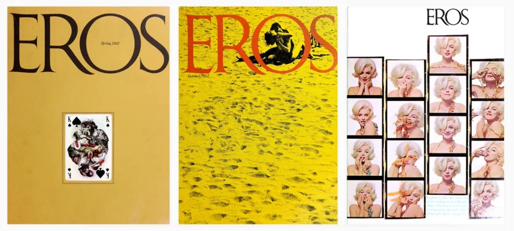
Lubalin communicated progressive ideas through ingenious typographic covers and layouts for magazines like Eros, Fact, Avant Garde and Venture. He interwoven styled type, white space, integrated imagery and minimalist grids to engage readers and amplify messages.
Crafting Expressive Typographies
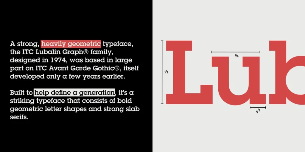
Yearning for more typographic control, Lubalin designed numerous custom typefaces, including Availability, Era, Serifa, Ronda, ITC American Typewriter and Lubalin Graph. These typefaces, with their oblique angles, branching ligatures and organic letterforms, became hallmarks of 1970s designs.
Some Notable Typeface Designs
| Typeface | Release Year | Defining Features |
| Era | 1967 | Slanted, elongated letterforms |
| Avant Garde | 1970 | Futurist, geometric letters |
| ITC American Typewriter | 1974 | Mechanical, typewriter-inspired |
Designing Iconic Identity Graphics
Lubalin crafted iconic logos and identity systems for many top magazines, publishers and culture brands, cementing his wide-reaching impact on America’s visual landscape.
Some Seminal Logos and Designs
Over a decade, this tremendous output of era-defining typography, publication design, and identity work has situated Lubalin at the vanguard of contemporary graphic design.
Co-Founding International Typeface Corporation (ITC)

Beyond his prolific design studios, Lubalin’s other lasting legacy was co-founding International Typeface Corporation in 1970 alongside business partner Aaron Burns and designer Ed Rondthaler.
ITC aimed to increase designers’ typographic options by commissioning and distributing high-quality, contemporary typefaces from top designers worldwide. Lubalin served as ITC’s initial creative force, designing over a dozen early typefaces.
Responding to Industry Technological Shifts
ITC emerged at a pivotal juncture as phototypesetting and new printing methods grew dominant, yet available typographies remained restricted. ITC ambitiously expanded typeface choices to leverage these technologies through organised typeface production.
Implementing a Fair Compensation Model
Uniquely, ITC split earnings 50/50 with commissioned typeface designers – an equitable model Lubalin cared deeply about compared to other corporations underpaying designers. This fair compensation drew talented designers to create stylish, risky typefaces eagerly.
Catalysing Typographic Renaissance
Through the 1970s and 80s, ITC released a torrent of contemporary, expressive typefaces, catalysing a renaissance in typography across graphic design. Hundreds of notable fonts from top creative talents flowed through ITC in this period, thanks mainly to Lubalin’s initial leadership.
ITC remains a leading global type foundry with over 1,500 typeface options – a testament to Lubalin’s vision, which greatly expanded typographic possibilities and equity within the design industry.
Impacts: Postmodern Graphic Design and Expressionist Typography

While Herb Lubalin sadly passed away in 1981, his design legacy continued to exert enormous influence upon postmodern graphic design, blooming in the 1980s and beyond.
Postmodern Graphic Design
Lubalin’s “Conceptual Image” philosophy pioneering impactful logos, minimalist magazine layouts and metaphorical visuals definitively shaped postmodern graphic design trends centred around communication through inventive arrangements of type, symbols and grids.
Expressionist Typography
Lubalin also catalysed a wave of expressive typography through the 1970s and 80s, seen in flowing, oblique typefaces evoking emotion. The hundreds of fonts Lubalin spawned through ITC and his prolific typeface designs underlie today’s dynamic typographic landscape.
In essence, Lubalin nurtured graphic design focused not just on aesthetics but on effectively communicating ideas. His intellectual, communicative ethos and ingenuity with typography, layout and symbols reverberate through design.
Conclusion: An Influential Design Legacy Across Logos, Typography and Communication
Over his prolific career, legendary designer Herb Lubalin crafted some of the most impactful logos, magazine covers, posters and typefaces of the 20th century. His iconic designs for brands like 7Up, Dodge and ITC American Typewriter remain instantly recognisable reflections of visual culture.
Yet, more importantly, Lubalin pioneered philosophies valuing graphic design’s power as visual communication. His works infused typography with expressive voice and meaning by fusing music, language and symbols. This ethos exalting thoughtful, communicative design continues inspiring new generations of designers.
Through co-founding ITC and designing profuse, inventive typefaces, Lubalin also redefined 20th-century typography, spawning an explosion in expressive fonts which define today’s vibrant typographic landscape.
Few designers have exerted such a wide-scale impact through their works and philosophies as Herb Lubalin. Over forty years since his passing, Lubalin’s designs and ideas around visual communication maintain profound relevance – a testament to his lasting legendary status as a graphic arts innovator. The creative spirit Lubalin brought to graphic design continues to inform and shape the field today.
Herb Lubalin FAQs
What were some of Herb Lubalin’s most well-known designs and typefaces?
Some of Lubalin’s most iconic designs include logos like the Avant Garde ITC logo, the 7Up “Fresh Up” slogan, and the flowing script logo for Mother & Child magazine. His most recognised typefaces include Avant Garde, ITC American Typewriter, and Lubalin Graph.
What creative philosophies defined Lubalin’s approach to design?
Lubalin pioneered “conceptual image” design focused on visually communicating ideas through inventive arrangements of symbols, type, and clever metaphors. He also viewed typography as “visual music” and infused forms with expressive, rhythmic qualities.
What lasting impacts has Herb Lubalin had on graphic design?
Lubalin helped define postmodern graphic design grounded in impactful visual communication. His influence also catalysed an explosion in expressive typography through his pioneering typefaces and co-founding of the ITC type foundry, greatly expanding font availability.
How were the album covers of Jazz music an early influence on Lubalin?
As a teen immersed in 1930s Jazz culture, Lubalin admired inventive Jazz album covers using collages, vivid colours and angled type to capture the energy of the music itself. This visual expression through typography informed his mature “visual music” ideas.
What essential roles did Cooper Union and early advertising jobs play in developing Lubalin’s design skills?
The intensive typography and communication studies Lubalin received at Cooper Union provided core skills he drew upon his whole career. Early advertising jobs also supplied crucial agency experience in commercial identity, packaging and promotion design applications.
Last update on 2024-01-12 / Affiliate links / Images from Amazon Product Advertising API

